Tuesday, July 24, 2012

The End of Growth Through Currency Wars


The End of Growth Through Currency Wars

by Dan Denning on 23 July 2012

Money Morning Australia


The Plaza accord was initially set up in 1985 and included five countries; the United States, West Germany, Japan, France and the United Kingdom.
What was it?


The US dollar was strong against all the major currencies towards the end of the seventies, giving American trading partners, like Japan, and Europe a competitive advantage when it came to their exports. This was becoming a political problem for the US. Car manufacturers lost market share and jobs to Japan.
What’s more, Europe and Japan were so addicted to export led growth that domestic consumption fell off a cliff. Economies in Europe, much like Japan, ran huge trade surpluses with the US but actually experienced economic contraction. 


The solution was now what’s known as the Plaza Accord of 1985, so called because it was negotiated in September at the Plaza Hotel in New York. Back then it was just the G-5. All five countries agreed to intervene in the currency markets to orchestrate a weaker US dollar.


The point of the whole exercise was to transfer growth from the US market to the rest of the world. The world has stopped growing. The monetary authorities agreed to engineer some growth by weakening the dollar (especially against the Yen and the Deutschmark) and encouraging consumption and investment in the rest of the world. It worked.It worked too well.


By 1987, the G-5 had expanded to the G-6 to include Canada. The G-6 gathered in Paris to sign the Louvre accord. This time their goal was to strengthen the dollar in the name of stability. Global growth had been rebooted, but the dollar’s slide had resulted in too much volatility in currency and financial markets

The Start of the Currency War


A currency war is fundamentally an attempt to improve economic competitiveness at the national level. The self-defeating aspect of a currency war is that you can only do so at the expense of your neighbours, whom you hope to make your customers. Your growth comes at their expense. They must consume in order for you to save.


This was fine back in 1985 with the Plaza accord. The US could effectively ‘lend’ growth to Japan and Europe. The US ran large current account deficits. But the key difference between then and now was that there was a strong currency (the US dollar) which could be weakened, and weak currencies which could be strengthened.


The US could let the dollar slide because the economy was booming. Jobs were plentiful. The government deficits were growing but not huge. Devaluation hurt, but only to the national pride, not in any noticeable way on a purchasing-power basis.


Today, there is no one currency against which all others can strengthen to everyone’s mutual benefit. Competitive devaluations have become a zero sum game, always costing one country jobs and exports. This is why Brazilian Finance Minister Guido Mantega said in 2010 that the world was in a new currency war. He knew that interest rates were being used by central banks as a weapon to deal with domestic debt problems and boost export competitiveness.


Effectively, everyone in the world is trying to boost their own economic growth by weakening their currency so they can sell their goods to other countries. This has led Europe, Japan, and the US all to the same place: zero real interest rates.


These countries have chosen to deal with deflating asset bubbles and low growth by lowering real interest rates. They’ve avoided a reckoning. But in so doing, they’ve zombified their economies, sucking out all the life of a dynamic market and injecting it with the formaldehyde of unproductive debt. They have also trod the path of currency devaluation down to its logical conclusion.

Protecting Your Investments in a Currency War


What I’m almost certain of is that this is just the beginning. If the currency war moves from interest rates and monetary and fiscal policy to cyber weapons, price manipulation and an attack on the financial architecture of the modern world, then a threat exists that is neither fully understood nor appreciated. So what can and should you about this emerging threat?

How do you create non-financial wealth and personal security?
Short of opting out of the current system and dropping off ‘the grid’ — a radical option that most of us are not in the position to choose and probably wouldn’t choose anyway — what can you realistically do to hedge against major losses in the share market as a result of deleveraging and major disruptions to the economy as a result of the evolving currency war of all against all?


Well, I think the answer lies in thinking about what wealth really is. I don’t mean to get philosophical. But really, it doesn’t hurt to think about why we bother to invest and protect and grow our wealth. Is it for the love of the game? Is it because we enjoy the challenge?


It may be for those reasons. But fundamentally, wealth creation and preservation is about having the freedom to live the life you’ve imagined for yourself, a life of purpose and creation and value, whatever value means to you. Financial wealth helps us achieve those ends. But it is not an end in itself. Building non-financial wealth means taking steps to improve your quality of life and personal security. For me, that means appraising the financial system with honest and sceptical eyes.It then means reducing the amount of my wealth at risk in financial markets and converting it into tangible assets that have utility.


For some people it may mean living a simpler financial life with less risk and fewer day-to-day decisions (peace of mind). This is probably a demographic trend we’ll see anyway. As the baby boomers approach retirement age, I expect those that are able to will begin liquidating their retirement portfolios and living off their accumulated savings.


Dan Denning
Editor, Australian Wealth Gamepla


http://www.moneymorning.com.au/20120723/the-end-of-growth-through-currency-wars.html

Saturday, July 21, 2012

Social-Economic Consequences of Malaysia's High Income Inequality

The Income Inequality have always been a thorny issue for the past few thousand years. During the Middle Ages in Europe, they have the bourgeois (higher class includes the Church) and the proletariat (ordinary folks). In ancient China they too have different class with the merchants and the artisans, court officials, laborers and etc. Needless to say the bourgeois and the merchants controlled most of the wealth.


Even during the ancient Babylonian days they also do have this problems. In George Clason's 'The Richest Man in Babylon', it describe how those who know how to accumulate Gold succeeds while the rest are mere laborers. To find the answer to the puzzle on why ordinary citizens don't know how to accumulate Gold, King Sargon summoned Arkad, who is the richest man at that time and accumulated the most Gold. Arkad disclosed to the King on how he managed to accumulate so much gold through 'Seven cures for a Lean Purse'. The following are the Seven cures for a lean purse.


1) Start thy purse to fattening
2) Control thy expenditures
3) Make thy Gold Multiply
4) Guard thy Treasures from loss
5) Make of thy dwelling a profitable investment
6) Insure a future Income
7) Increase thy ability to earn


The above are the classic guide on how to be Financially Independent. It has been proven to this day after more than a few thousand years in existence.

The question is how can we measure Income Inequality? Fortunately it can be measured with a statistical approach known as the Gini Coefficient.The Gini Coefficient was developed by a statistician named Corrado Gini, and it is a measure of the income distribution of the population in a country. It range between 0 and 1 with 0 being in perfect equal and 1 being highly unequal. It helped define the gap between the rich and poor nations. The income distribution of a nation can also be represented graphically with the Lorenz curve below.


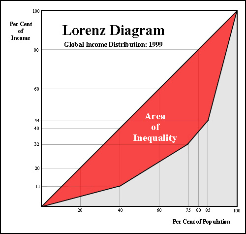
The upward sloping 45 degrees sloping line represents the equal distribution of wealth. An example will be the intersection point of the 20% of the income distributed and the 20% of the population. On the y-axis (vertical) you have the income distribution as expressed in decimals and on the x-axis you have the wealth of the nation. The area that is shaded in red represents the ‘area of inequality’ in income distribution. So the flatter the Lorenz curve the bigger will be the 'area of inequality' and hence income distribution.


An example of unequal distribution is where the 11% of income intersects with the 40% of the population on the Lorenz curve. This shows that 11% of the income is distributed to 40% of the population.


How Malaysia compared to the rest?

Anyway as of 2009 Malaysia is ranked 102 out of 136 countries surveyed by the CIA for the most unequal income distribution. The following is the income distribution of different ethnic in Malaysia and also its Gini coefficient from 1995 till 2009.


Column1Column2Column3
GINI Coefficient Of Malaysia
Etnicity
2004
2009
Bumiputra
0.452
0.44
Chinese
0.446
0.425
Indian
0.425
0.424
Others
0.462
0.495
MALAYSIA
0.462
0.441


Source : Economic Planning Unit 2009


The performance of Malaysia’s Gini Coefficient from 1995 – 2009


Source : Department of Statistics Malaysia


According to World Bank, Malaysia was one of the few East Asian countries that reverse its income inequalities over the past decades but unfortunately reverses its direction since the 1990s. In other words policies drafted by policy makers since then are not effective.

This may be due to the bias policies that are drafted to the benefit of the ‘Bumiputra’ community while neglecting others and also the emergence of a new ‘ruling class’ that are make up of political cronies. This new group are given special treatments and are encouraged by the ‘powers to be’ to gobble up much of the nations strategic and big businesses in order to make up what they called the ’30 percent Bumiputra quota’.

Needless to say the end result is the re-emergence of the old Colonial type of ‘Rent Seeking’, businesses where being the monopoly or duopoly is the order of the day. As we know being in a position to monopolize any sector of the economy will only resulted in being contented. No incentive for being innovative and competitive made this conglomerates being redundant and badly managed and in the end left to decay.

Good examples include MAS, PERWAJA STEEL, PROTON and Bank Bumiputra just to name a few.

What are the Consequences?

Effects on economic Growth

  1. High inequality in income will have negative effects on economic growth. One study done by economist Andrew Berg and Jonathan Ostry of the IMF recently found that the countries with higher inequality of income tends to have a shorter spell of economic growth than those that with  more equality.

Getting the economic growth going is easier than maintaining or sustaining it. This is because there are many economic policy tools that can start an economic growth like embarking on a loose monetary policy and expansionary fiscal policy. However maintaining a sustainable economic growth for a certain time period say 10 years is a task not to be taken lightly because after a certain time period certain economic policies tend to run its course and boom will be followed by bust.

To maintain the level of exports in an export oriented economy during economic downturns, policy makers normally will have to devalue their currencies against their competitors or reduce the interest rates in the domestic banking sector. The problem is how much interest rate can you reduce? Even economies like Japan and the U.S that are running close to ZIRP (Zero Interest Rate Policy) but yet still failed to increase its exports and turnaround their economies. In the case of Japan, it is worse off as its economy went into a tailspin and pushed its economy into a deflation mode.

Coming back to the IMF study, they found that in order to reduce income inequality by a certain percentile say 10% then the number of years of sustainable economic growth will have to be doubled. It can be shown by the following graph.


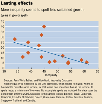
The Vertical axis is the number of years of sustain growth and the horizontal axis is the Gini Coefficient. As you can see if you want to reduce the Gini coefficient from 48 to 44 you have to increase the years of sustainable economic growth from 5 to 10 years. So if a country have a high Gini coefficient then it is very difficult for it to reduce its income inequality because it will need a prolong sustainable economic growth. This can explain why Malaysia’s income inequality remains high throughout the last 20 years because it is very difficult to maintain a high economic growth rate for many years. Moreover its economy had been experiencing a few boom and bust cycles for the past decades.  

  1. Due to income inequality the wealth of the nation will be concentrated to a few individuals which constitute the top 1% of the population. As a result more people are forced to borrow more and more to meet ends need. With the top 1% controlling most of the country’s wealth it is no surprise to see the mean income remained low or unchanged for the past decades. As a result since most of the population are in the lower end of the income spectrum it will be difficult to see any increase in spending to uplift the economic activity that is needed to drive economic growth.

A good example will be the amount of wealth held by some of the political cronies such as Syed Mokhtar. He is the favored crony of UMNO (United Malay National Organization) party and is said to have his hands into almost every major business in the country. He controlled a few public listed companies such as Tradewinds, MMC, Bernas and etc in the KLSE. Through many Mergers and Acquisitions with Proton (the National Car) being the latest addition to his stable of companies, he managed to accumulate debts to the tune of RM34 billion. It is said that his borrowings are equaled to 10% of all loans that are made by all banks in Malaysia. However, it is only backed by about RM 7.8 billion in cash and assets.

Is he Highly Geared?

To find out we shall use the following formula.

Gearing Ratio = Debt/Equity

Gearing Ratio = 34/7.8 = 4.35

As for the gearing ratio, anything above 3 is considered high and 4.35 is what I called ‘Highly Geared’. It is quite impossible to maintain such high gearing during trying economic times like now. Any further downturn in the economy will cut into the operating profits and will severely affects his group of companies cash flow. In addition he will also need cash to service his debts regardless of how bad the company is doing.

The end result will be another bailout by the government and we will see a rerun of the 1998 Asian Financial Crisis saga where the government bailout many of its political cronies business empires. This will represent another attempt by the Government to use taxpayer’s money to artificially prop up uncompetitive companies. It is another classic case of throwing good money after bad money.  A good example will be Halim Saad’s Renong Group of Companies which is a diversified conglomerate that is worth to the tune of more than RM 20 billion. Although initially being bailed out by the government however eventually it still failed to survive the crisis.
In view of the impending collapse of the Syed Mokhtar’s empire, how can we take advantage of the situation?
How to trade the Syed Mokhtar Short?
There are two possibilities whereby it can cause the collapse of the Syed Mokhtar Group of Companies.

One, it is the expected defeat of the current ruling coalition or Barisan Nasional (National Front) in the soon to be held election this year.A good example will be the former Premier Badawi's son counter Scomi and his crony's Equine. During his tenure both are high fliers but today they are no where o be seen.

Two, it will be the current ongoing global financial crisis. With such high gearing you don’t even need the collapse of the Global Financial Crisis to push it over the cliff. It will collapse eventually because most of his businesses are not ‘cash rich’ and recession proof in nature unlike a casino. Other than rice distribution and toll operations, his other businesses in ports, car manufacturing, hotels, manufacturing and etc are not only ‘cyclical in nature’ but also 'capital intensive' and will be influenced by the ups and downs of the global economy.

So when either of them happens then we shall do the ‘Syed Mokhtar Short’. First you need to sell off your stocks in the KLSE and then load up the short contracts on KLCI futures in KLOFFE. In other words we perform a short sellingon the KLCI futures. A word of caution though because such maneuver is only for those in the know or the professionals. If you have no experience in the Futures market then we suggest the best strategy is to cash out and wait for the downturn to run its course and this may take 6 months to 2 years depending on how severe is the downturn. After that then you load up on the stocks.


  1. There will be class warfare
It will create what we call the ‘Elites’ which belongs to the 1% and ‘the rest’ and there will be tensions among them. The Government will find it difficult to get the support of ‘the rest’ group to follow its policies such as to promote savings or spending because they afraid in the end it only benefits the ‘Elites’.  A good example is the Government’s recent launch of its recent Bon Malaysia which pays a 5% yield. Although it pays higher than the commercial bank’s term deposit rate of about 3.2% on average but it is still under subscribed because the population believed that the funds raised will be channeled to unproductive ventures like bailing out crony companies, coming election campaign funds, paying for subsidies and etc.
 
Another unintended consequence arising from this class warfare is ‘distrust’ of the lower income group in the Government’s effort to reduce income inequalities either through taxation or salary redistribution (minimum salary). For any income redistribution system to work, the government must ensure that those people enlisted to such responsibility should be competent, trustworthy and transparent in their process. If this can be accomplish then people will not mind policy makers taking a portion of their money through taxes for the greater good and in this case a rebalancing of the income inequality in the society. If not then people will be less willing to part with some of their money by under declaring their taxable income.

  1. Effects on Health
Due to the big disparity in the income distribution needless to say those belong to the lower rung in the income distribution table can least afford better healthcare. Those who belong to the top 5% in the income distribution can afford better private healthcare and hence life expectancy. By relying on public healthcare it will further burden the government by allocating more funds to build more hospitals, employ more nurses and doctors and hence less funds can be diverted to other development projects.


With Malaysia’s high Debt to GDP of about 53.5% in 2011, it will be a difficult task for it to reduce its debt because the growth of debt will always be faster than economic growth. Why is this so? This is because Debt servicing in the form of interest rate grows exponentially through what we called ‘compound interest’ while economic growth only grows organically due to the boom and bust cycles. Economic growth can be likened to the shape of the Sine Wave or S curve below.


The following graph depicts the difference between the growth of Money or Debt versus the growth of the real economy.


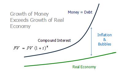
As can be seen from the above, once the growth between compound interest and the real economy (GDP) starts to diverge then the gap between them will start to widen. This implies that once our Government’s debt reaches a certain level to GDP then its ability to pay back its debt will very difficult if not impossible. From empirical evidence in the last few years from the ongoing financial crisis in Europe, whenever a country’s Debt/GDP reaches above the 70% threshold then there is a very high probability that its economy will go into a tailspin in the next few years. This is because once the Debt/GDP ratio increases it will decreases the country’s ability to service its debt because more money will be needed to repay its interest and hence less will be directed towards the real economy that will help generate more income.

Moreover when a country’s Debt/GDP ratio increases, its Sovereign ratings risk being further downgrade by Ratings Agencies. Whenever a country’s Sovereign ratings being downgraded then its ability to raise funds in the international market will be dampen because its cost of funds has increased. Bond holders will need to be compensated for holding the higher risked Sovereign Bonds now and hence the yield (interest rate) will be higher.  

In Conclusion

With Malaysia’s Debt/GDP being 53.5% and without any real effort to address this problem, it will soon shoot up to the 70% threshold. If left unchecked then in a few years time Malaysia will be heading towards the path taken by Ireland, Greece, Portugal, Spain and the soon to join the club Italy.  

Again another key area that the government needs to do is to gain the Trust of its people. Since most of the government revenues are raised from taxes and if it wants to collect more then it will need to give them the assurance that the money will be spend wisely and on projects that will further improve their life in the future. A corrupted government like Malaysia will find it tougher to achieve such a goal because it first needs to overhaul its political system to make it more transparent in order to win the trust of its people. Further increases in taxes will be countered with more revolts as people felt more burdened by increase in their cost of living.

Monday, July 16, 2012

The Art of Speculation Series 8 - Keep Emotions at Bay


I am sure most of us who have invested in the stock market been ‘burned’ by holding on to losers. The problem in investing is because we tend to attach our emotions towards our investments, be it stocks, commodities and etc.  What happens next is that before you realized the value of your holdings had depreciated much almost close to zero. 


We tend to hold on to our investments because there is always a hope that things will turned for the better and eventually we will be able to recuperate our investments. However I do have my fair share of bad investments and it never recuperated back to the price I paid with some of them totally wiped out. However it served as a lesson that I learned from the market which eventually helped me to avoid bigger losses as my trading career progressed.


Opportunity Cost


Stocks or Commodities or any investment in particular are mere objects of possession. As an investor we shouldn’t place too much feelings or remorse towards them. We sell it when the price went up higher than we bought after comparing the ‘opportunity cost’ of investing in other ventures such as time deposits, paintings, real estate and etc.  By right investments in stocks or commodities should be straight forward, buy when the risk/reward is attractive and sell them at higher prices.

However due to the marketing effort by the so called ‘stock jobbers’ and promoters that try to personify these investments and hence imbue human qualities into them. Hence they will associate stocks with emotionally attach words like ‘widow, retirement or orphan stocks’. As a result people tend to hold on to their stocks even though they are experiencing hugh losses.

As a result of holding on to stocks and refuse to sell we are subjected to the following psychological pitfalls which further alienate us from cutting our losses.


Psychological Pitfalls


  1. Mental Accounting. By mental accounting we refer to a situation where we tend to hold on to an investment even though we know that there are better investments opportunities around. A good example will be a stock or real estate inheritance from our parents. Due to the sentimental value we place on such inheritance we don’t tend to either cut loss or sell it off so as to invest into something else.
  2. Sunk-Cost fallacy. Refers to a situation where we have committed some financial resources into an investment and sticking on to it even though better investments are available. An example will be the purchase of a ticket to a concert. We tend not to give it a miss even though it is raining heavily because we have already paid for the ticket. This will also affect our decision not to cut loss even though our investment turns out bad because we have already committed financially. In other words we tend to throw good money after bad investments.
  3. Endowment effect. This situation arises because we tend to place a greater value to something just because we owned it. We will tend to hold on to our stocks even though it had dropped 50% because we tend to believe that one day it is going to make a comeback. In one experiment where the researchers sold some movie tickets to the participants at $10 each and in return asked them how much they are willing to accept in order to part with their ticket. The prices range from $12 to $25 because they feel that they should be paid more for something they owned even though the price of the tickets are still going for $10 in the cinema.

In conclusion, in order to be successful in investing we need not only know how to have a strategy, good money management skills, able to read market through both fundamental and technical analysis but we also need to avoid both emotional and psychological traps that comes with any investments.


By ignoring these psychological pitfalls your road to success in investment will be confronted with many obstacles ahead because your portfolio will be burdened by many under performed stocks.

Monday, July 9, 2012

How the Malaysian Government Manipulate the CPI figure?

The Consumer Price Index measures the movement of goods and services purchased for consumption over a period of time.  It is a very good measure for households to evaluate their financial position and purchasing power over time. As far as we know, folks like us knows that the prices of goods and services had risen much for the past few years and yet the government had been telling us the contrary. This is because according to their calculation based on the CPI, the basket of goods and services only goes up by 2-3% per annum. As we know all governments lies about their inflation figures. They will report inflation figures of 2-3% even though the prices of food, fuel, education, medical expenses and etc have been sky rocketing in the past few years.


Why CPI figure matters?


CPI figure has always been of importance to Government policy makers. Since the CPI is a measure of the price level of goods and services, it will help provide a good picture on the ‘temperature’ of the economy. Policy makers will need to know the condition of the economy whether it is over heated, under perform or just right? The Government will then use monetary policies like SDR, Interest rates and etc to influence the economy.


How to Calculate the CPI?


So how do we measure the Index? This can be complicated because literally there are thousands if not millions of goods and services out there. If we were to include every one of them in our calculation then it will be quite impossible to compute the Consumer Price Index. This is because the data collection and matrix of computation based on various weightages given to different products and services is just mind boggling.  How can we solve the problem?


One way is to classify them ‘into a basket’ that will represent the majority of the products and services that will be consuming in a year.  To illustrate on how to calculate the Consumer Price Index, we shall base our study on a fictional economy with the following assumptions.


  1. Only five products – Milk, Sugar, Flour, Honey and Salt
  2. It is a closed economy and new products are not added in
  3. Period of study is 3 years
  4. Total consumption is 1 unit per year (be it in kg or liter) for all products to simplify our illustration.
  5. Since there are only 5 products there will be no grouping under Food or Energy and etc.


Prices
YearMilk Sugar FlourFuel (lt)ChickenTotalPrice Index
2000
3
1
1.5
2.5
4
12
(12/12)x100 = 100
2001
3.3
1.2
1.8
2.7
4.2
13.2
(13.2/12)x100 = 110
2002
3.8
1.6
2.2
3.6
5
16.2
(16.2/12)x100 = 135


Legend:

  1. The Total column is the total of all five products. For example in year 2000 the Total consumption is 12 which is (3+1+1.5+2.5+4).
  2. To obtain the Price Index you have to have a base year and in this case Year 2000 shall be our Base Year. So for year 2000 it is 100, 2001 is 110 and 2002 is 135.
  3. To obtain the inflation rate we will use the following formula.
Price increase = Cost of Basket current year/Cost of Basket Base Year x 100. So to compare the price difference between Year 2000 and Year 2001, we will obtain, (13.2/12) x 100 = 110. Hence the price index in 2001 had increased 10%. Similarly, a comparison of the prices between 2000 and 2002 yield a difference of 35 (135-100) and thus prices had increased 35% in two years. So by now we hope that you already have a grasp on how the CPI is being calculated before we move on to analyze the actual CPI of a country and in this case Malaysia.

Malaysia’s CPI classification 


Malaysia’s CPI report is divided into 12 groupings which consist of about 460 itemized goods and services. The following is the CPI table as released by the Department of Statistics , Malaysia with the weights assigned to each of the 12 groups. The year 2010 is the base year and hence the value is set equal to 0 as per our example above. The full report can be read from this link.


http://www.statistics.gov.my/portal/index.php?option=com_content&view=article&id=1619%3Aconsumer-price-index-malaysia-may-2012-updated-2262012&catid=71%3Aconsumer-price-index-malaysia-&Itemid=153&lang=en


Table 1 : CONSUMER PRICE INDEX FOR MAIN GROUPS, MALAYSIA (2010=100)
Group
Wt.
Index
% Change
Jan
2011
Dec
2011
Jan
2012
Jan 2012 /
Dec 2011
Jan 2012 /
Jan 2011
TOTAL
100.0
101.8
104.2
104.5
0.3
2.7
Food & Non-Alcoholic Beverages
30.3
102.6
106.6
107.5
0.8
4.8
Alcoholic Beverages & Tobacco
2.2
104.6
104.6
104.6
0.0
0.0
Clothing and Footwear
3.4
99.9
99.6
99.4
-0.2
-0.5
Housing, Water, Electricity, Gas & Other Fuels
22.6
100.8
102.5
102.6
0.1
1.8
Furnishings, Household Equip. & Routine Household Maintenance
4.1
101.0
102.5
102.9
0.4
1.9
Health
1.3
101.5
103.6
103.9
0.3
2.4
Transport
14.9
103.2
104.9
104.9
0.0
1.6
Communication
5.7
100.0
99.4
99.4
0.0
-0.6
Recreation Services & Culture
4.6
99.7
103.1
103.2
0.1
3.5
Education
1.4
101.0
103.2
104.1
0.9
3.1
Restaurants and Hotels
3.2
103.2
107.5
107.8
0.3
4.5
Miscellaneous Goods & Services
6.3
101.1
103.9
103.8
-0.1
2.7
Non-Food
69.7
101.5
103.2
103.2
0.0
1.7
Durable Goods
6.5
100.2
101.2
100.8
-0.4
0.6
Semi-Durable Goods
4.4
100.2
100.3
100.2
-0.1
0.0
Non-Durable Goods
41.6
102.9
105.5
106.1
0.6
3.1
Services
47.5
101.2
103.8
104.1
0.3
2.9


Or can be shown graphically with the following Pie Chart.


Based on the above and the weights assigned to the main groups, the overall price increase is recorded at 2.7 % which can be shown by the following.


YearPrice Index Difference
Jan-10
100
0
Jan-11
101.8
1.8
Jan-12
104.5
4.5


So based on the above the price increase from Jan 2010 – Jan 2011 is 1.8% (1.8 – 0), Jan 2010 – Jan 2012 is 4.5% (4.5 - 0) and from Jan 2011 to Jan 2012 is 2.7% (4.5 - 1.8). So does the inflationary figure (2.7%) represent the actual price increases of all the 460 items in the market place? Or could it be higher if not due to the Government’s manipulation of data, wrongly classification of groups and misleading weights assigned to the different groups?  


What are the flaws in the CPI?


  1. Food accounted for too much weightage in the CPI


Based on the above Table, the Food and Non Alcoholic grouping accounts for 30.3% of the total CPI weighting. This can be quite considerable when we compare it with the rest of the world. The following chart is the for the food component as a percentage of the CPI for 25 countries around the world.


As you can see from the chart above when you take out the countries at both the head and tail end of the spectrum (India – 47.1% and US 7.8%) then the statistical bias will be reduced and it will provide a more accurate picture. After the adjustment the mean for Food Component of CPI in the 23 countries is about 17.3%. So Malaysia’s 30.3% food weighting in the CPI can be considered on the high end of the table after China’s 31.4%. The question is whether our 30.3% of the food component actually reflect the price rise in the CPI.


From Malaysia’s CPI table above the price difference in the food component from Jan 2011 to Jan 2012 only recorded a mere 4.8% increase. But according to FAO (Food And Agriculture) Organization of the United Nations, the price of basic food necessities around the world have increased by 28% for the past year. So can we conclude that it is due to Malaysia’s ability to managed its food production much better than the rest of the world or the FAO’s figure is inaccurate?
    
Main Group and Sub-GroupWeightageJan 11 - Jan 12   % Change
01. Food and Non-Alcoholic  Beverages
30.3
4.8
   001. Food away from home
10.04
5.1
   011. Rice, Bread and other cereals
4.39
1.5
   012. Meat
2.94
5.4
   013. Fish and Seafood
4.5
10
   014. Milk and Eggs
1.77
6.2
   015. Oil and Fats
0.58
1
   016. Fruits
1.2
2.1
   017. Vegetables
2.14
-0.6
   018. Sugar, Jam, Honey
0.59
5
   019. Food Products
0.81
7.5
   010. Coffee,Tea, Cocao Beverages
1.37
3.2


The above Table is the breakdown of individual items that comprises the Food and Non-Alcohol Beverages Grouping. Can anyone tell me what is ‘food away from home’ and  the difference between it and the Restaurant in the 11th grouping? And why assign such a big weighting (30.3%) on it?


Anyone who has been to the wet market recently will tell you that as compared to last year’s  prices of vegetables increased by more than 30%, seafood more than 30%, fruits  more than 20%, milk and eggs certainly increased much more than 6.2%. Or in other words prices have increased more dramatically over the years.


Since sugar is one of the more important food items because it is used in almost all Food and Beverages, it is certainly flawed to assign a weight of only 0.59% together with Jam and Honey. As we know the price of sugar had increased by almost 100% since FELDA took over the business from Perlis Plantation a couple of years ago. Since sugar is used in most F&B, the ‘trickle down effect’ is certainly very great. Whenever there is an increase in the price of sugar, restaurants and food operators also took advantage by increasing their food prices. This will result in a ‘pass on inflationary’ effect on prices of other things even though there have no direct relation to sugar.  


So what can we deduce from here is that the different weights assigned to the Food Grouping in the CPI classification is biased. More than 30% of the weighting on the Food Grouping comes from ‘Food away from Home’ which nobody seems to understand the nature of it. Fish, meat and vegetables are under represented because they only accounted for less than 10% of the total since they make up most of our daily expenses. It should account for higher than 10% if it were to reflect a more accurate representation of consumer expenses on food.


  1. Bias weighting in Housing,Water,Electricity,Gas and other Fuels.


The second grouping that is in dispute that we would like to discuss is the Housing,Water,Electricity,Gas and other Fuels. Before we go on let’s take a look at the items that consist the Housing grouping.  


Main Group and Sub-GroupWeightageJan 11 - Jan 12   % Change
04. Housing,Water,Electricity,Gas & Others
22.59
1.8
   041. Actual Rental for Housing
17.24
1.8
   043. Maintenance and repair of Dwelling
0.67
1.7
   044. Water Supply & Misc services
1.34
0.5
   045. Electricity, Gas and Other Fuels
3.34
1.7

Source : Department of Statistics, Malaysia


The above are the items that represents the Housing,Water,Electricity and Gas Grouping. If we do not look into the breakdown of the Grouping then it might be justify to assign such a big weighting since it is also known as ‘Energy Grouping’. However as you can see most of the weighting goes to ‘Rental for Housing’ which was allocated a lion share of 17.24% out of the 22.59% or 76%.  Electricity, Gas and other Fuels only take up 3.34% while the Water Supply share is 1.34%. Heck, since when rental is more important than Electricity and Gas in our daily expenses? 


By putting less importance to Electricity and Gas and Other Fuels in the ‘Energy Grouping’ any price increase by the Government in Fuel and Electricity ‘will only have minimal impact’ on the overall grouping and hence the calculation of the CPI figure. Even with the rising of energy prices, it will have a less profound effect on the CPI because Electricity and Gas only takes up about 3.34% of the average Malaysian consumer expenditure. 


  1. Health Group weighting is too low


Health expenses only accounted for 1.3% in the weightage of the CPI? The average income of a Malaysian household is about RM 14,016 per annum according to the Household Income Survey done in 2009. So based on the above statistics the average Malaysian household can only spend about RM 182 per annum (1.3% x RM14,016) on health expenses. Does this seem logical since health care cost has been ever rising for the past years? Again let us look into the details on the Health Grouping below.


Main Group and Sub-GroupWeightageJan 11 - Jan 12   % Change
06. Health
1.32
2.4
   061. Medical products, Appliances & Equip
0.83
2.3
   062. Out Patient Services
0.31
3.1
   063. Hospital Services/In Patient
0.18
1.4

Source : Department of Statistics, Malaysia


Is it justifiable to agree to the Department of Statistics that we spend only about RM182 per annum (yes, not per month) on medical expenses? As we know a visit to a private doctor (General Practitioner) will cost at least RM35 and was up from RM25 in 2009. Another thing that is not mention is the ‘Medical Insurance’ expenses in the above Grouping. A look at the whole CPI classification also failed to mention medical insurance except in Misc Goods and Services in Grouping 12 where it mentioned life insurance (weigh 0.44%) and insurance connected to accident and health (0.14%). How can life insurance have more weight than health insurance when we spend much more on health than life insurance on our income? The big problem in under weighting the Health Grouping is because health care is the ‘biggest and most consistent’ source of inflation over the years.


  1. Education – Flawed in weightings

As for Education, it only accounted for 1.41% of the total. We believe that education in grossly under represented as the cost of education had going up in double digits especially in the tertiary level. The following is the breakdown of the Education grouping.


Main Group and Sub-GroupWeightageJan 11 - Jan 12   % Change
10. Education
1.41
3.1
   101. Pre Primary and Primary
0.61
4
   102. Secondary Education
0.38
2.4
   103. Post Secondary non-tertiary
0.12
4.8
   104. Tertiary Education
0.14
0.3

As can be seen from the above, the weights given to the different sub groups are clearly flawed. As a starter Education as a Main Group accounts for only 1.41% of the total CPI weights. Secondly Pre-Primary and Primary education seems to be given more weights than Secondary, Post Secondary and Tertiary education. Since when the Kindergarten and Primary Education are more important and take up more expenses than the secondary and tertiary education?  


Moreover tertiary education seems to have the least weights which indicates that it is less important and hence makes up the least on expenses in education. By right it should be exactly the opposite with most weights given to tertiary education with the rest o n the descending order. Damn lies, since when studying in Kindergarten cost more than studying in Universities?


  1. Restaurants and Hotels


The Restaurant and Hotel Grouping seems to be confusing. What is the difference with the Restaurant and cafes expenditure over here and ‘food away from home’ in the Food Grouping?  Anyway below is the breakdown of the grouping.


Main Group and Sub-GroupWeightageJan 11 - Jan 12   % Change
11. Restaurant & Hotels
3.2
4.5
   111. Expenditure in Restaurants & Cafes
2.95
4.8
   112. Accomodation Services
0.25
2

Since our expenditure in Restaurants and Cafes take up quite a hugh chunk of our income when we eat out (unless you stay at home and cook), we feel that the weight that is assigned to Expenditure in Restaurants and Cafes is too low. As we all know eating out has always been getting more expensive these days. We feel that a higher weighting should be assign to this grouping (something like 8-10%) to reflect the changes in our lifestyles nowadays where people prefer to eat out than to cook at home.

  1. Transport


The next grouping that we are going to examine is Transport. The following is the table for the Main and sub-grouping of Transport.


Main Group and Sub-GroupWeightageJan 11 - Jan 12   % Change
07. Transport
14.92
1.6
   071. Purchase of Vehicle
2.9
-0.4
        0711. Motocars
2.55
-0.4
        0712. Motorcycles
3.2
-0.3
        0713. Bicycles
0.03
0.6
  072. Operation of Personal Transport Equip
11.08
2.3
        0721. Spare parts
0.37
6.2
        0722. Fuels & Lubricants
8.77
1.9
        0723. Repairs and Maintenance
1.36
3.6
        0724. Other Services
0.58
1.1
  073. Transport Services
0.94
1.5
        0731. By Railway
0.03
0
        0732. By Road
0.69
1.8
        0733. By Air
0.11
1.4
        0734. By Waterway
0.07
0.2
        0735. Other Transport
0.04
1.6


In transport under the sub-grouping of 071 you will notice that there is a column for the purchase of motorcars. It is given a weighting of only 2.55 which we understood is well under represented. In actuality, monthly payments for vehicle hire purchase constitute more than 15% of the average household disposable income. 


To illustrate further, we use the Perodua Myvi (a rebranding from Daihatsu) as our base calculation on monthly hire purchase payment since it is the best selling car among Malaysians. The low end version of the Myvi cost about RM44,400 and with the average household income of Malaysian at RM 14,016 (RM 1,168 per month). For a loan of 90% (RM 41,400) with a repayment duration of 9 years, consumers will have to fork out about RM466 per month for the hire purchase payments. Heck, since the monthly loan repayment take out about 40% (466/1168) of the disposable income, why is it only assigned a weighting of only 2.55?  Moreover it also recorded a drop of -0.4%.


In Summary


The above are some methods that the government used to manipulate to CPI data so as to under report the actual inflation rate. There following are also the fundamental flaws that the government use to suppress the CPI value and hence the inflation rate.


  1. The Chain weighting system.
What is chained CPI? Chained CPI is actually the grouping of a few years CPI figures and average them up. The end result will be the reduction in the CPI figure because instead of using the traditional basket of goods as a base for calculation the chained CPI. Say for example the inflation rate for 2008 is 5%, 2009 is 6% and 2010 is 7%, so by chaining them together will give us an average figure of 6% for the 3 years. The end result will be the under reporting of the CPI index by up to 30%.

  1. Neglect to take into consideration of substitutes. Due to the price increase, consumers will ways to adjust their lifestyles by substituting lower quality products for higher quality ones. For example when the price of imported beef form Australia increased by 20% then cost conscious consumers will automatically switch to cheaper substitutes which may be the Local beef or imported Indian Beef which command a lower price. As a result of the increased demand for cheaper substitutes, it will also caused a price increase. However we afraid that such increase in price is not recorded in the CPI calculation because the breakdown in Meat in the Food grouping only consist of fresh, frozen or processed meat.

  
Main Group and Sub-GroupWeightageJan 11 - Jan 12   % Change
01. Food and Non-Alcoholic  Beverages
30.3
4.8
   001. Food away from home
10.04
5.1
   011. Rice, Bread and other cereals
4.39
1.5
   012. Meat
2.94
5.4
         0121. Fresh Meat
2.28
5.3
         0122. Frozen Meat
0.3
7.2
         0123. Processed Meat
0.36
5.2

Since Meat is broken down into Fresh, Frozen or Processed then any increased in the price of substitutes might not be included into the CPI calculation. Furthermore not all prices move in the same amount and direction further complicates the calculation for the CPI. The Meat sub-grouping can be further breakdown into Beef, Chicken, Lamb, Pork and etc. For all you know, the price of Chicken may move up faster during the certain time of the year or because there is a short supply of chicken due to the foot and mouth disease. Similarly the price of beef might go down because one of the importers had ordered a hugh consignment from India and hence create an over supply situation.   

  1. The basket of goods consists of too few items. In America, the basket of goods from the Bureau of Labor Statistics (BLS) consists of more than 80,000 items. In Malaysia under the Department of Statistics their basket of goods only consist of about 460 items which we believe is very under represented and that is why on most sub-grouping like meat, fish, fruits and etc there are no further breakdown.  

Any solution to counter higher inflation?


The Government can claim that there is a low inflation rate of 2-3% because we as the consumers are adjusting our lifestyles. Instead of eating out 4-5 times a week, now we can only afford to eat out only once or twice a week due to increasing cost. Hence when we cook more at home and eat out less, the government can claim that the overall food costs have decreased. 


So in the end we can conclude that it is the Government that is controlling and manipulating the CPI figure so as to under reporting the inflation rate. Since the calculation of the CPI is based on the basket of goods and services that will reflect the patterns of consumer spending hence its movement is also subjected to Supply and Demand economics. 


Increase Supply

One way to help reduce prices is to increase the supply of the goods and services that is experiencing a price hike. For example, to reduce the ever increasing health cost the government can build hospitals, clinics and also engage more doctors. We do have what they call the ‘1Malaysia Clinic’ which charges only RM1 per visit but what good is it if you can hardly find any doctors attending to them most of the time.
Similarly to address the problem of the increasing cost in education , the government can either build more schools and universities or provide more cheap loans to students. Since future economic growth varies directly to today’s investment in human capital more emphasis should be given to education. 

Take China for an example, for the past decade China had been investing heavily in the education sector to the tune of hundreds of billion of dollars or more than 1.5% of GDP annually. Since the last decade the amount of higher education institutions had more than doubled from 1022 to 2263. You will be surprised that studying in China is cheaper than in Kuala Lumpur. Due to the economies of scale in education the tuition fees at China’s top Universities comes to less than US4000 per annum. 

According to the President of Yale University Professor Richard Levin, in 25 years time Chinese Universities would rank in the world’s top 10 Universities with Tsinghua (49 at the moment) and Beijing Universities leading the way. Over here things are going exactly the opposite where the rankings of the local universities kept falling due to its ineffective education policies and also its choice of teaching staffs that favors certain ethnicity.

For essential items like rice and sugar, the government can help reduce their prices by issuing more import permits to more companies instead of relying on one company that holds the monopoly on import permits. In Malaysia the rice trade is basically controlled by Bernas which is owned by a political crony while the sugar trade is controlled by FELDA after acquiring Robert Kuok’s interest. Additionally the government can award more TOL (temporary permits) to farmers to farm idled or unused land so that the national food bill can be reduced since food consist of more than 30% in the CPI  weightage.


Remove Trade Barriers

Another way to reduce the cost of living is to get rid of trade barriers and reduce import taxes on vehicles. Due to its protectionism policy and the government’s intent to protect its local car venture (Proton), it imposed hefty import taxes (more than 100%) on imported cars. As a result it put a heavy burden on its people by having to pay expensive hire purchase payments. Since the National car industry is bleeding red ink year after year it will be a futile attempt to keep it a going concern. It might be a better policy to scrape the project completely and at the same time reduce the import taxes on imported cars. By reducing the price of imported cars it will lessen the burden of the people by paying less hire purchase payments and hence more money available to spend on other things.


In conclusion

The statistics provided by the Department of Statistics does have many questionable and controversial weightings in their formulas and hence does not provide a true picture of the actual inflation rate. If not due to the manipulation of the CPI value through biased weighting and grouping, the inflation rate would be much higher than the reported 2.7%. If they could have reclassified the groupings and weightings then we believe the actual inflation rate could be as high as 8% which is three times the current rate. We believe that a better and unbiased model to calculate the CPI would be the one that can include as many goods and services as possible. 


One good model would be the Billion Prices project developed at MIT. This models includes more than 1 million goods and services both online and offline. Data are collected daily from online retailers by using a software to scan through the web for updated prices and store in a database. The result will be an array of products that are sold by online retailers and is included ‘in a basket of goods’  which could be used to calculate the daily, weekly, monthly and yearly CPI figures.