Monday, January 21, 2013

Is Malaysia's Economy heading for Bankruptcy in 2019?

Malaysia can be considered a success story in terms of economic development. It successfully transformed itself from being a backwater undeveloped economy to a middle income country. It manage to do that by transforming its resource based to a manufacturing economy and also able to reposition its economy by attracting much of the Foreign Direct Investments during the 1970s and 1980s. Transfer of technology and also modern managerial skills that are brought about by the Multinational Corporations (MNC) also helped build up our pool of skilled labours which in needed in our economic transformation in the later years. Due to the transformation and repositioning of our economy it also altered the importance of certain sectors of the economy which is shown in both the composition of its exports and imports.

Our exports are now consists of electrical and electronics – 35%, palm oil – 15%, petroleum products – 9%, LNG – 7% and the rest are made up of timber, various manufactured goods and etc. Our imports are mainly made up of machinery and transport equipment – 60%, manufactured goods – 12%, fuel - 10% and chemical - 9 %. The interesting thing to note about Malaysia’s imports is that the bulk of it are made up of ‘Capital Goods’ and not consumer items such as food, beverages and etc.  When a country imports more capital goods than anything else it shows that this country is on the right track to a ‘sustainable developing’ economy because these capital goods such as machineries and transport equipment will be used to furthered the production of manufactured goods and hence helped promote economic growth.

Government watering our wages?

Below we present to you several development and income metrics of the Malaysian Economy which we hope to help you understand where our money gone and also why our ‘income distribution’ is not catching up with the system. We hope you can bear with us as it is quite statistical and boring.

The macroeconomic metrics we used are the following:

  1. Wages in Manufacturing
  2. Malaysia GDP
  3. Wage/GDP index
  4. Malaysia Government Debt/GDP
  5. Malaysia Money Supply M3
  6. Malaysia GDP per capita
  7. Malaysia Government Spending
  8. Malaysia Consumer Spending
  9. Malaysia Consumer Price Index
  10. Malaysia Government Budget

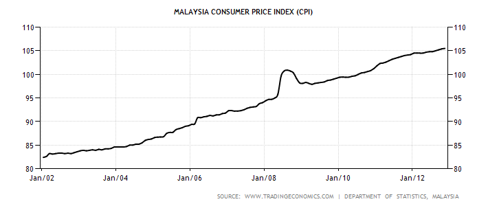
Later we will also show the inability of income to catch up with general price level of goods and services or inflation which is measured by the CPI. Hopefully it will also help us to answer the following question on whether the authorities are watering our worker’s wages?

Why our Income lagged GDP Growth?

As far as we know there are not many papers written on this subject and reasons being the lack of interest or simply not reported in the mainstream media to avoid any troubles with the power to be. Anyway we present to you 2 charts on the wages in manufacturing and also the GDP growth of Malaysia as a basis for our comparison. Wages in manufacturing is selected because the manufacturing sector employs the most people in Malaysia.  


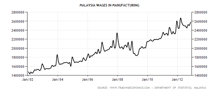
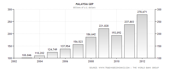
The following is a chart on the Manufacturing wages to GDP that we plot using data from the above wage and GDP charts. It clearly shows that the worker’s share of the GDP has certainly been dropping since 1999. So where have the bulk of the remaining GDP went?


Certainly not us and you folks! The main culprits are the Government and its unscrupulous cronies and capitalists. With the projected FBMKLCI earnings growth of 8.0 and 8.4% for 2013 and 2014 respectively, obviously things are looking good for the corporates ahead.  With an average earnings growth rate of 8% for the past couple of years while the ratio of Wages/GDP declining it is obvious that those bastard capitalists have been capping the increase in wages so as to maximise their profits. Since Malaysia’s competitive level has been declining, the question is how those companies are able to keep recording increasing profits?

Green Belt help creates scarcity

One explanation will be the effects of inflation and the other being the existence of so called ‘Green Belt’ industries. The term Green Belt originated in London during the 1930s where the periphery of land surrounding the city was accorded this status. Property developments are discouraged in this area by tough regulations so as to create what we call ‘scarcity’ in economics. The main reason is to control the amount of housing in this area so that property prices and rents will always be high because there are not many choices or alternatives to choose from. Another reason is to control the amount of people living in the city so that the city will be free from congestion, pollution and other social problems that are associated with increased population. In Malaysia we have our version of the Green Belt in Kuala Lumpur. It is located in the Bukit Bintang area and also known as The Golden Triangle. Rentals in this area are able to match those in other major cities around the world like Singapore, Taiwan, New York and so on.

Coming back to our discussion on Green Belt companies that are able to capitalize their strengths from scarcities that arises within their Industries. Due to the nature of granting licenses in Malaysia, it enable many companies virtually operate in a monopolistic manner. Economists call this type of behaviour ‘Rent Seeking’ which is common in Malaysia. Due to their Green Belt status like which commands scarcity, there are able to charge higher price to consumers at their whims and fancy. Take the Cable TV business as an example, there is only ONE company that has the license to operate this business. Due to scarcity and being the monopoly, consumers are left with one choice – take it or leave it. When they raised their prices last year subscribers have no choice but to succumb to their whims.

Similarly in the power generation business licenses are given to the so called IPPs (independent power producers) to generate electricity which in turn sold back at a much higher price to our national utility company (TNB). These IPPs are able to enjoy Green Belt status as there are ensured that the barriers of entry are high and TNB will have to buy whatever amount of electricity that are generated. As a result these companies are assured of big profits every year. Other companies that enjoyed Green Belt status are PLUS Highway, Petronas, Indah Water, Bernas, FOMEMA and many more. These companies are able to raise prices without attracting much competition from competitors due to their strength from scarcity.

Malaysia’s Government Debt/GDP had been stabilizing around the mean of 43 % up till 2009. However since the year 2010 it had shot up to 55.4 % and had been remaining above the 50 % since then.  This is attributed to the RM 67 billion that is raised during the 2009 period in respond to the 2008 Global Financial crisis which was used as a stimulus package.

This sudden upsurge coincides with the increased in the Government spending which is reflected by the record deficit of -7.4 % of GDP in 2010. The following chart shows the gradual increase in the Government spending which only accelerates in recent years.  Having a Debt/GDP of 52 % doesn’t mean we are in a comfort zone because when Ireland and Portugal defaulted their Debt/GDP is less than 70%. Further to this we cannot compare to Japan whose Debt/GDP is 211 % as of Nov 2012. We will explain shortly why Japan’s economy will not default even with such high level of debts.    

Government Pump Priming the Economy

Pump priming refers to efforts by the Government to inflate the economy by initiating policies that will help expand the economy and hence its activity. It is no secret that most Governments in the world today are artificially boosting their economy either by depreciating their currencies, creating trade barriers or simply embark on an expansionary monetary policy in order to achieve full employment. The world economy is currently facing an extremely challenging time ahead as most Western economies are contracting and what will happen next will be the inevitable ‘Currency Wars’. By this we mean sooner or later each and every country will have to compete with each other by devaluating their currencies so as to make their exports cheaper which will help create jobs. Side effects of currency wars are Global Central Banks will increase their efforts to protect their economies by printing more money, create tensions among nations, beggar thy neighbour and lowering of bond yields due to currency interventions will also help increase interest rate sensitive consumption.

To begin with Malaysia’s money supply had been steadily increased for the past few years. The following chart shows Malaysia’s Money Supply as of 2002 till 2012.


Malaysia’s total Money Supply consists of M0+M1+M2+M3 which can be divided into the following,

  1. M0 which is the most liquid of all. This includes notes and coins in circulation and also assets that are easily convertible to cash.
  2. M1 is the second group of the total money supply and this also includes M0. As of Nov 2012 it stands at RM 270.48 billion.
  3. M2 refers to the short term time or fixed deposits in banks plus M1. As of Nov 2012 the total is RM 1.32 trillion.
  4. M3 is the long term time or fixed deposits in banks plus M1 + M2. The total figure for M3 as of Nov 2012 stands at RM 1.34 trillion.

How much has our Money Supply Grown?

From the records above, our total Money Supply in January 2002 was RM 475 billion but it somehow managed to explode upwards to RM 1.34 trillion in November 2012. This represents an increase of about 268% for the period of 10 years. Whereas in the U.S during the same period from 2002 to 2012, the total Money Supply as measured by M2, grown from $ 5426.2 billion to $ 10408 billion. Period to period in percentage terms their Money Supply had only grown by 91.8% (10408-5426/5426). This can be shown by the following graph.


How indebted are our consumers?

Due to the improving economic conditions since the Global Financial Crisis in 2008, Malaysia’s GDP per capita has also been improving. Since 2002 the GDP/Capita has been rising from the low of US 3933.94 to US 5364.50. This can be shown by the following chart.


The rise in income has altered the consumer spending pattern. There is a macro shift in consumer spending from the traditional ‘needs based’ to a ‘wants based’. This means consumers are splurging on luxuries rather than necessities. Consumers are more willing to splurge on the latest hand phones, luxury handbags, ipads, fine dining, overseas travel and so on without ever giving it a thought. As a result of their addiction to spending they began to look for more avenues to raise cash like credit cards and personal loans and hence lead to an explosion in the consumer debt level. The following two charts shows the upward trend in their spending habits and also helped to explained the explosion of both the public and private sector debts.


The trend in consumer spending in Malaysia seems to be edging higher and higher with no end in sight. Thanks to the our Government’s earlier effort in promoting a consumer spending economy and at the same time relaxing the requirements to obtain loans so as to create a ‘loose money’ economy albeit there have been efforts to curb such practices recently . From the above chart consumer spending rose from RM 59300 million in January 2005 to RM 99812 million in September 2012 which represents a 68 % increase during this period. Government controlled medias have been telling folks that the economy is recovering and we are moving forward to better times. In reality our private sector is one of the most indebted in the region and their debt level can be considered ‘up to the eyeballs’.

The following chart is the household debt/ Disposable income of several countries and Malaysia is no doubt the leader among them.


Deteriorating External Sector

Malaysia’s receipts from exports are also down especially from the plantation sector following the decline of Global Commodity prices. As a result Malaysia’s external sector has also been affected. Palm oil price is at RM 2400 down from the high of RM 3820 in 2011 and similarly rubber prices remain low trading at less than RM 1000 compared to the high of RM 2160 in 2011. Hence there are less funds available for the Government to spend as a result it incurs deficits in its budget.


A budget deficit is a situation where the Government spends more than it received. From the above it seems that our Government had been running budget deficits since 1999 till today. To finance budget deficits normally there are three options available to the government and they are reducing public spending, increase taxation or borrowing. Given the current depressed economic scenario, increase taxation in the form of income and sales tax may place further burden to the already over stretched consumers in Malaysia.

Reducing public expenditure will be out of the question because it will entail slower economic growth and will be suicidal politically in the upcoming elections. The last option will be to borrow from abroad through issuing sovereign bonds to foreigners or to local institutions like EPF and so on. Thus this will further increase our debt burden and eventually will also increase our Government’s Debt/GDP. The problem with higher Debt/GDP is that interest will have to be paid and in this case to foreigners although their share represents about 25% of the total. This will represent a leakage in the economy and hence there will be less money circulating around our economy and will certainly affects the level of economic activity.

Nevertheless the main threat to the Malaysian economy is its debts although our Debt/GDP ratio has yet reached critical level. The lesson we must learn from the Global Financial Crisis during 2008 is that the majority of the countries that went bust had their Debt/GDP below 70%. Below is the Debt/GDP table of those countries that fell during the Crisis.

Table 1.  Eurozone Countries Government Debt/GDP
Column1Column2Column3Column4Column5Column6
Country
2008
2009
2010
2011
2012
Cyprus
58.8
48.9
58.5
61.3
71.1
Iceland
28.5
70.5
87.8
92.8
99.2
Ireland
25.1
44.5
64.9
92.2
106.4
Portugal
68.3
71.7
83.2
93.5
108.1
Spain
36.1
40.2
53.9
61.5
69.3
Italy
103.6
106.1
116.4
119.2
120.7
Greece
105.4
112.9
129.7
148.3
170.6

Source : Trading Economics

Any Risk in Defaulting?

As can be seen from the above, Malaysia cannot rest on its laurel that its Debt/GDP (52.6 %) is within manageable level. We must know that in normal market conditions risk and reward follows a linear path and that means higher risk will be compensated by higher return. However during extreme market movements (during a crash) risk and reward will follow a non-linear path meaning higher risk will not be compensated with higher return. In a Micro level an individual investor’s perfectly diversified portfolio that consists of many stocks and other derivatives will not be able to withstand extreme market movements. Say for example a 10 % drop in the FBMKLCI will normally result in a bigger decline in his portfolio and hence the P&L. Similarly on a Macro level Malaysia’s well diversified economy will not be spared either if one or two of its crucial macroeconomic metrics such as exchange rates (drop susceptibly) or interest rates (sky rocketing) reacted negatively to big market moves.

Further to that even if they try to pre-empt any extreme market movements by stress testing their portfolio or economy will not work. Evidence during the 2008 crisis proved that even though the banking industry tried to stress test their robustness with Quantitative Finance Risk Management tools such as VaR (Value at Risk) and CrashMetrics, it proved that is not sufficient to overcome to severity of the Crisis. Without bailouts from the authorities many of them will not be around by now.   

In Summary

The other day I was reading some articles written by some of our local analysts saying that Malaysia will not face any risk of defaulting because of our strong fundamentals. Further to that they argued that we cannot compare Malaysia with Greece or Spain because they had a history of defaulting and Malaysia has never defaulted before. What denial !! But there is always the ‘first time’ and we must remember that the first cut is the deepest. Malaysia is able to escape much destruction on its economy during the Asian Financial Crisis back in 1998 because that Crisis was mostly confined within the South East Asian region albeit causing a few mini crashes here and there in Russia and South America. But what is coming soon is a different animal and it is on a Global scale. The fuse has already been lit by the recent Currency Wars.

Tuesday, January 8, 2013

Ponzi Finance - Ponzi Wealth

Ponzi Finance - Ponzi Wealth
By: Andrew_McKillop

WHAT GOES UP, GOES DOWN
Officially released on Jan 1, 2013 the Boston Consulting Group's "shock report" by Daniel Stelter and his colleagues on what 3 decades of Ponzi finance has done to real wealth in the developed-OECD group of countries has been available since mid-December but not widely commented. The title says it all: "Ending the Era of Ponzi Finance"


To be sure, equity and commodity markets kicked off Year 2013 with a traditional refusal and rejection of the real world - the financial markets need to drag in more hopefuls, more stupid and more greedy right up to the wire. That is their role and mission and has nothing to do with the economy, it is only a midsize but permanent Ponzi scheme. The BCG report describes what has become, in less than 30 years, a giant Ponzi scheme: the entire economic system of the developed world. It now has literally no choice but change. Real change has to come, not Ponzi-style loose change.


The BCG report details why the biggest threat of all has nothing to do with the world's balance sheet, but its income statement. It is now crushingly evident that we, in the debtor countries of the formerly wealthy world, do not have enough cash flow to cover either the principal or the interest. Our only hope is that the asset used to try paying down the ever-growing debt bubble - this "asset" is the entire economic system - can grow and will grow faster than the total debt financing cost.


THE RACE FOR GROWTH

This makes for only a few options, discussed in the BCG report but which we can summarize very easily. One basic option, if it was possible, is to rewind the economy to the 1960s when, the BCG report says, $1 invested in the US economy produced 59 cents in new GDP; at the start of the 2000s, still declining today, the 10-year average is about 18 cents. This can be called the productivity of investment and capital. Where the rest went is simple: to the Ponzi scheme of false wealth and totally certain losers "down the line", meaning all succeeding generations, saddled with unpayable debt.


The 1920-era Italian immigrant to the US named Carlo Ponzi created the scheme the world remembers, like the bigger and better scheme of Bernie Madoff which foundered in 2008. In both cases these criminals were engaged in a race for growth from Day 1 of their operating schemes. In neither case were the "underlying assets" of any real weight or consequence, although the Madoff scam had a much more elaborate advertising prospectus and back up communication system. Basically of course, no productive investments were made by either of these renowned criminals: the final result was total loss. The incoming revenue paid off previous debt and financed short-run consumption, nothing else.


Economists use the term "Ponzi scheme" to describe a disastrous mechanism in which a financial operator assigns debt and pays off old debt by constantly taking on new debt. The repayment of the debt -- more recent loans plus interest -- is constantly pushed into the always increasingly distant future, fuelling an endless process of debt refinancing. To be sure, if productive investments were made with the debt, these investments growing at least at the same rate as the increase of debt, the process could continue; if not, it can't.


The Ponzi-Madoff fake wealth scam has however, and dramatically, been switched from private citizens to the majority of governments - not only or especially OECD governments, but most starkly in the developed nation group. The financial operators running the scheme are the private banks. Banks in Europe, on the basis of broadly convergent data including analyses by the BIS entered 2012 with about 725 billion euros in combined debt. Altogether they received, in different ways, a total of about 280 billion from governments and the ECB in year 2012, but today at the start of 2013 have about 1000 billion euros of combined debt. How was this possible? In other words how did they "lose" around 280 bn euros in 2012?


In fact and showing how near the end of the Ponzi scheme we are, private banks in Europe are estimated to have received close to 280 bn euros only in the first 3 months of 2012. Whenever the private market is off-limits to them, they rely on the ECB to bail them out. The ECB is now lending them fresh money -- as much as they want -- at minimal interest rates. Otherwise, as their CEOs have repeatedly and unashamedly said to government leaders, they will close their doors and governments can sort out the chaos and panic.


The likelihood that the banks are able, let alone willing to repay recent loans, certainly those since 2008, at some unspecified date in the future often placed at "about 2030", is absurdly low. This in no way is the end of the story because Ponzi finance-Ponzi wealth is not only cancerous for banks - transforming them into organized crime syndicates - but parasitic and destructive of the real economy. Understanding why this is the case needs us only to backtrack to the subject of "productivity". Completely the opposite of anything that Ben Bernanke, Mario Draghi and their lookalikes feel obliged to say, economic system wide productivity is rapidly turning from bad to worse, year-in and year-out.

SORRY, THE FUTURE IS CANCELLED

Real productivity of investment capital, labour and land or natural resources is declining. Estimating the transition level for hedge financing and speculative financing morphing to outright and impossible to honour Ponzi financing at a rate of debt-to-income of 60%, the BCG report says this has happened to an increasing number of OECD governments: from 2000 and only concerning the EU27 and USA, the total of "Ponzi debt" relative to "payable debt" has spiralled to attain about $11 trillion for the US and $7.5 trillion for Europe at end 2012. Another way of looking at this estimate is to take those amounts as debt that can never, ever be repaid and should be "forgotten".


Ponzi schemes, when they founder as they always will, often throw up worse-than-anticipated numbers for the losses, and have longer-term negative spill over on investor sentiment and the optimism of economic deciders. For the government-and-bank Ponzi scheme of the developed nations, today, the BCG report states that actual and real, continually accruing but well-hidden debts of governments are increasing. Only "deleveraged" by a few governments and some private corporations (countries currently deleveraging include the US, Japan and Italy), the real level of government debt may be the double of the above figures. For the US and Europe therefore, the total of Ponzi debt could easily be $35 trillion, but we will never know.


The number of unknowns are as the BCG report says, large and increasing. One stark example concerns old age retirement pension funding. This future economic, social and political crisis is programmed and set in stone, and, when mixed with the poison of Ponzi finance as "the new normal" for financing practices, as much part of the New Economy as an iPad, sets heroic or perhaps impossible challenges for society. The report rightly says that "the welfare and pension crisis" in all developed countries, is deadly for the economy as we know it. Basically people live longer but retire earlier - and younger generations will have to work longer at lower net income, to pay off the debt taken on to pay current retirees. This sounds like it could or might be feasible - until we look at what has happened to younger employed, we mean unemployed persons in the "mature democracies": they are among the first who are junked into the gutter of massive unemployment, with most OECD countries having at least 20% unemployment for their 16-25 year olds. In many countries the rate of youth unemployment is well above 33%. As a stark proof of total disinterest in the future, this one is hard to beat.


Significantly, of 8 developed countries analysed by the Bank for International Settlements (BIS), only three - Japan, Germany and Italy - did not show an almost certain strong, even massive growth of public debt to 2040, for the simplest of reasons: their population size is falling.


The problem of course is that today in 2013 it is "politically impossible" to further increase public debt. For private employers, starting with the largest employer companies in sectors such as the car industry, the simplest readout is to limit recruitment to the maximum, on a continuing basis, and encourage employees to quit work, if or when deals can be struck with labour unions, on one side, and government on the other to limit the costs of "voluntary" labour shedding and no new net job creation. Disguised unemployment and early retirement however only shift the debt burden back to the state, and guarantee that future economic growth will be weak or zero.


BACK TO BASICS

As well known and proven despite feeble rear guard action by some "Keynesian inspired" economists, increasing government debt beyond about 80%-85% of GDP always results in lower trend rates of economic growth. Debt strangles growth. This subject is usually and wilfully confused with what percentage of GDP passes through state or state-related entities, called Public Spending, and what amount stays private from start to finish. As shown by the wide variations (from 25% to 60% of GDP) of this spending in different countries, and their debt crises, this subject is not so important as the major problem - in fact crisis - of declining economic productivity and rising debt whether it is public or private, noting again that they 'morph' or 'transition' from one to the other.


The BCG report is constrained to examine "what went wrong", and cites the work of economist Robert Gordon (Northwestern University, USA) who has repeatedly argued that starting as early as the 1950-1960 period, real economic growth and real wealth have trended downwards, for a large number of convergent reasons. As he puts it: the invention of indoor plumbing had an orders of magnitude more important and longer lasting positive economic impact than iPads, Twitter and Facebook. More easily measured and running diametrically opposite to the claims of Ben Bernanke, Mario Draghi and other lookalikes the real economic productivity of capital, labour and resources has declined, especially since the 1980s.


The Ponzi answer is what we live, or survive every day: the inflation of selected asset classes or groups starting with housing. For private households in the straight majority of developed countries, today, the continued "appreciation" of their housing is taken as basic and certain. Inflating housing prices enables more private household debt to be taken on, perpetuating the scam. The perverse impacts as the BCG report points out, are economy-wide and include falling rates of interest and increasing resort to high risk and fragile Ponzi-style "investing", either operated directly by households, their banks and investment advisers or by the state.


The system-wide impacts are, to be sure, much larger and extend far beyond the proven and known decline in economic growth and economic productivity as debt continually rises, whether private or public, and always finally public. The end result is "sovereign default", which is known but is often treated as "only known in the history books".


Avoiding sovereign default is lengthily treated by the BCG report, which lays down 10 needed steps starting with an immediate reduction of the debt overhang by a mixture of writeoffs, restructuring, austerity, higher taxes, inflation, and raising employment. Most of these are political no-no items, which as the report says will almost certainly result in the continuation of what we have now: paralyzing uncertainty and refusal to act. Addressed by a political class or generation that prefers War and Circuses to Bread and Circuses, the sheer size of the economic breakdown threat is forcing them to act less irresponsibly.


The Boston Consulting Group report warns that now is the time to inform the public, and to act because social breakdown always follows economic breakdown. As former IMF chief economist Raghuram Rajan cited by the report puts it: "Ultimately a capitalist system that loses its public support loses any vestige of either democracy or free enterprise"


By Andrew McKillop
Contact: xtran9@gmail.com


Former chief policy analyst, Division A Policy, DG XVII Energy, European Commission. Andrew McKillop Biographic Highlights


Co-author 'The Doomsday Machine', Palgrave Macmillan USA, 2012
Andrew McKillop has more than 30 years experience in the energy, economic and finance domains. Trained at London UK’s University College, he has had specially long experience of energy policy, project administration and the development and financing of alternate energy. This included his role of in-house Expert on Policy and Programming at the DG XVII-Energy of the European Commission, Director of Information of the OAPEC technology transfer subsidiary, AREC and researcher for UN agencies including the ILO.

Monday, January 7, 2013

Wealthy Indian spends £14,000 on a shirt made of GOLD

Wealthy Indian spends £14,000 on a shirt made of GOLD to impress the ladies (and if nothing else it means less ironing for them!)
  • Shirt took a team of 15 goldsmiths two weeks to construct
  • Has matching cuffs and a set of rings crafted from left-over gold
By Jill Reilly (Mail Online)
PUBLISHED: 16:35 GMT, 4 January 2013 | UPDATED: 23:51 GMT, 5 January 2013

It is often said that money can't buy love.
But trying telling that to a wealthy Indian man who splashed out £14,000 on a solid gold shirt in the hope it will attract female attention. 


Money-lender Datta Phuge 32, from Pimpri-Chinchwad, commissioned the shirt which took a team of 15 goldsmiths two weeks to make working 16 hours a day creating and weaving the gold threads.


Golden appeal: Wealthy Datta Phuge has splashed out £14,000 on a solid gold shirt to make sure he's

a 24 karat hit with women in central India


Work of art: Money-lender Datta, 32, from Pimpri-Chinchwad, says the shirt took a team of 15 goldsmiths two weeks to make working 16 hours a day creating and weaving the gold threads
It comes complete with its own matching cuffs and a set of rings crafted from left-over gold.


'I know I am not the best looking man in the world but surely no woman could fail to be dazzled by this shirt?' he explained


'The gold shirt has been one of my dreams,' Mr Phuge told Indian newspaper the Pune Mirror.


'It will be an embellishment to my reputation as the ‘Gold man of Pimpri"' Mr Phuge said.
The gaudy shirt was assembled on a fabric base of imported white velvet, and comes with six Swarovski crystal buttons and an intricate belt, also made of gold.


Golden appeal: 'I know I am not the best looking man in the world but surely no woman could fail to be dazzled by this shirt?' he explained

Read more:
http://www.dailymail.co.uk/news/article-2257209/Wealthy-Indian-Datta-Phuge-spends-14-000-shirt-GOLD-impress-ladies.html#ixzz2HIldn06K
Follow us:
@MailOnline on Twitter | DailyMail on Facebook

Friday, January 4, 2013

FBM KLCI Short Term Outlook - Pull back very soon !!


Ever since the last time we recommended a ‘buy’ on the FBMKLCI in the week ending November 2012, there had been much changes in the market both fundamentally and technically. On the fundamental side the P/E ratio for FBMKLCI as of December 2012 stands at 15.8 which is a tad away from the historical mean of 16. That means we are at the high end of the reading meaning there should be limited upside for the FBM KLCI in the short term. Anyway this is a quick analysis and market update as I am quite hastily assemble the data plus my hands are full of unfinished or remnants from last year and also a bit of travelling in the coming months especially to Indonesia. Things are really moving in Indonesia where their market is sizzling. They have record new listings, M&A activities and also their average daily volume traded in BEI is more than double our local market.

Over the Cliff?


On our local front the technical side point towards an extremely overbought situation and it seems like our market is about to ‘go over the cliff soon’. As we have alerted during the last correction in November 2012, the market had been dropping continuously for 18 days and we also pointed out that such stuff don’t happen every day. Anyway to cut the story short, in the immediate term our market is dangerously overbought and seems like it had peaked for this run. It moved up from the low of 1590.67 points in November 28th last year and managed to ram up about 100 points to close at 1692.65 today (03/01/2013).

P/E Bench Marking


We again caution those amateur investors who are now feeling the ‘top of the world’ or ‘invincible’ as the index is making another new high. But if you look at the prices of most stocks they are not only trading below their previous high but also below the prices at the beginning of the year. This represents a weakness in the market and a divergence in performance between the stocks and the market index. What cause this? One explanation will be the ‘exit of smart money’ from the market. Institutional and mutual fund investors normally employ what they called the ‘P/E  Benchmarking’ strategy in their day to day stocks trading. P/E benchmark trading refers to a trading strategy used by large institutional investors to compare their stocks to the industries and market. They will use the P/E ratio as benchmark to evaluate how ‘expensive or cheap’ their stocks as compared to the industry and the market. When the P/E of a particular stock is trading at a premium to other stocks in the same industry and also the market then it’s time to get rid of the stock and vice versa.

As we have mentioned above the current market P/E is about 15.8 which is very close to the historical mean of 16. This represents less than a 1% discount (15.8/16 = 0.98%) and certainly will pose a limited potential on the upside. Contrary to popular belief that institutional investors tend to hang on to their portfolio for long periods so as to maximize their return. In reality they tend to trade the markets as frequently as they can. Large investors especially the mutual funds have their costs to cover monthly such as salaries, rental, bonus, operating expenses and etc.

Income & Growth Models


There are two investment models available to those large investors and there are the income and growth models. In an income model most of their funds are invested in fixed income assets and their return will not able to achieve their profit target after deducting their ‘expense ratio’. The expense ratio refers to the percentage of the fund’s assets they charge for managing a fund which average between 1% to 3% a year. This will definitely affect an investor’s rate of return because the fund manager will deduct the expense ratio regardless whether the fund lose or make money on that year. Hence in order to beat the market they tend to take on higher risk and return by adopting the growth model. This will mean that they will be more aggressive in their investment approach and will always keep their ‘portfolio fresh’. By this it means that those folks will be trading more aggressively and normally will have an annual turnover of more than 100% of their portfolio.

On the technical perspective the FBMKLCI, as we already mentioned earlier it is on the verge of going over the cliff. We present below the daily one year FBMKLCI chart.


From the above chart you notice that there are 3 divergences occurring at the same time which is represented by the green arrows. At the top section which is the price chart the FBMKLCI index seems to be on the uptrend while both the MACD and RSI indicators are showing the opposite trends. This shows weakness in the FBMKLCI index and we believe the trend will reverse as soon as next week. This phenomenal is also known as structural weakness and whether it is going to be a normal correction or market top is left to be seen on how it will perform in the coming week. From what we see from the above the target for the next down move will be,

1692.65 - 1590.67 = 101.98

50% retracement = 101.98/2 = 50.99 or 51 points (rounded)

The next FBMKLCI target should be 1590.67 + 51 = 1641.47 points

If the market cannot hold at 1641.47 points, we suggest you should take some action to rebalance your portfolio.

Disclaimer On : The above represents our view on the market based on our analysis and is only a guide on the movement of the market index. You should not solely use it to time your stock market trading.